Social Media Showcase Vol.02
A diverse collection of social media visuals crafted for leading brands, balancing brand consistency with platform-native creativity.

Overview
This collection showcases a range of social media visual designs I created while collaborating with creative agencies in Vietnam. From bold lifestyle visuals for local tech companies to refined, insight-driven campaigns for household brands, each social post was crafted to align with the brand’s core values, communication tone, and business goals.
The challenge in these projects was not only to maintain brand consistency across fast-moving content platforms but also to strike the right emotional note, whether it's confidence, humor, elegance, or trust. By blending visual storytelling with strong design systems, I aimed to help each brand stand out in the competitive digital space and connect meaningfully with their audiences.

Việc Làm 24h (24h Jobs)
Job Platform
Time
2023
Role
Concept, Art Direction, Visualizing
Creative Team Credit
The Dot Agency
Brand Insights & Creative Directions
This wasn’t just about job listings - it was about reintroducing a legacy recruitment brand to a new generation. Việc Làm 24h had name recognition but needed visual storytelling to match its ambition after a major rebranding effort.
We built a system centered around one cheeky, meaningful symbol: the "chair"- a metaphor for career opportunities in Vietnamese culture. Whether it was the “director’s chair” or “waiting room seat,” our visuals turned this motif into a playful yet poignant character.
Social posts ranged from relatable Gen Z memes to serious career insights, all framed within a cohesive graphic language that was bold, bright, and emotionally intelligent.


Hảo Hảo Acecook
FMCG / Instant Noodles
Time
2020-2021
Role
Art Direction, Visualizing
Creative Team Credit
iProspect Vietnam - Creative Team
Brand Insights & Creative Directions
With one of the most beloved instant noodle brands in Vietnam, the task was to modernize without alienating. Hảo Hảo is more than a snack - it’s a cultural staple. But social media required us to speak the language of fun and relevance.
We combined pop-style illustration, doodles, and dynamic KOL integrations to reflect Hảo Hảo’s youthful energy. Each visual was crafted with bold, saturated color and expressive type, making even a simple pack shot feel alive.
Humor, trendiness, and subtle nostalgia coexisted in our direction, creating posts that not only performed well but added new dimension to a classic brand.


Honda Vietnam
Automotive
Time
2020-2021
Role
Concept, Visualizing
Creative Team Credit
iProspect Vietnam - Creative Team
Brand Insights & Creative Directions
With Honda’s legacy in Vietnam already well-established, our focus for the AirBlade motorcycle line was on energy, precision, and aspiration. This was about motion - both literal and symbolic.
Social visuals showcased the AirBlade as more than a vehicle; it was a lifestyle extension. We leaned into cinematic compositions, sleek shadows, and directional elements that mimicked speed and control.
With a color palette that felt masculine but modern and storytelling that emphasized both engineering and emotion, each visual reinforced the message: this is the ride for those who know where they’re headed.


Laurier Vietnam
Personal Care
Time
2020-2021
Role
Concept, Visualizing
Creative Team Credit
iProspect Vietnam - Creative Team
Brand Insights & Creative Directions
Laurier is soft, subtle, and impeccably composed - values that needed to extend across its social presence. Designing for a feminine care brand meant treading the line between emotional resonance and elegance, while never sacrificing clarity.
Our approach layered visual softness with typographic precision. Light gradients, airy layouts, and symbolic storytelling helped address sensitive topics with grace.
Each post invited trust without being clinical, and connected with young women through aesthetics that respected their intelligence and inner world.


Panasonic Vietnam
Electronics
Time
2020-2021
Role
Visualizing
Creative Team Credit
iProspect Vietnam - Creative Team
Brand Insights & Creative Directions
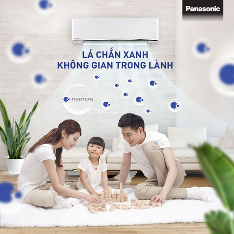
The Panasonic brand is synonymous with reliability - but for social media, we had to turn that safety into visual engagement. Our content focused on the air conditioning line, requiring a look that was cool in every sense of the word.
We embraced a white-and-blue palette that evoked both cleanliness and modern efficiency. Key features like antibacterial filtration, quiet modes, and energy-saving capabilities were turned into elegant infographics and minimalist animations.
In a market where trust is built visually, this refined, minimal direction allowed the brand to stand out without overstating. Panasonic’s message was simple: innovation you can count on, with comfort you can feel - right at home.


