BIT22
Modern, bold brand identity for Vietnam’s rising automotive leader.
Creative Direction
When I began working on BIT22, I knew this wasn’t going to be just another automotive logo. The founder had a clear vision — to build a bold, trustworthy brand that could grow beyond local trading into something bigger, more respected, more scalable. But he didn’t want it to feel like a corporate entity; it needed to feel strong, driven, and full of grit — like the industry itself.
My challenge was to strike the right balance between boldness and discipline. The name “BIT22” already had strength and memorability, but it lacked clarity in tone. I didn’t want to rely on predictable automotive clichés like tires or speed lines. Instead, I started exploring form and motion — how the letters could carry the identity themselves.
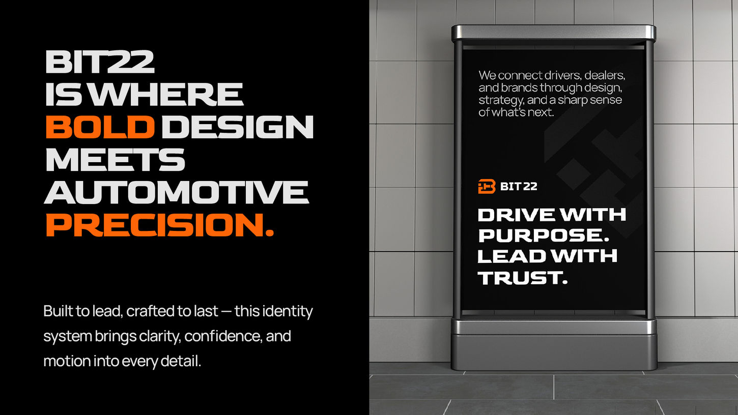
Through a process of sketching and reduction, I developed a compact geometric symbol built entirely from the initials “B-I-T.” At a glance, the logo reads as a strong mark. But with a closer look, it also subtly suggests a person gripping a steering wheel — a nod to the driver’s perspective and the brand’s human-centered approach. This layered visual meaning became a key turning point in the project. It gave the logo emotional depth without sacrificing simplicity.
Typography and color choices weren’t just aesthetic decisions — they were tools to enforce consistency across applications like vehicle branding, invoices, packaging, and service signage. Every decision had to be functional at scale, because this wasn’t a brand for the showroom — it was for the field.

Project Type
Branding
Time
Jun-Jul 2023 (1 month)
Role
Brand Identity, Logo Design, Concept Development
Credit
Tai Phan - Creative Director at The Dot Agency
BIT22 stands for “Best In Town 22”, a name that embodies the founder’s ambition to lead Vietnam’s automotive service and trading market. From B2C dealerships and accessories to B2B collaborations with manufacturers, BIT22 is envisioned as a future-forward bridge in the automotive industry — bold in its approach, trusted in its execution.
When I was brought on to develop the brand identity, the goal was clear: to create a visual system that felt modern, confident, and scalable — a brand that looked new but carried the weight of something trustworthy and established. It had to speak to Vietnam’s rapidly growing auto landscape without leaning on short-lived trends.


Project Summary
BIT22 challenged me to balance bold visual energy with structural precision. It was an exercise in designing with intention — every shape and line had to be justified. I learned how to craft an identity that could scale confidently, speak across touchpoints, and still feel human at its core. More than just a logo, this project pushed me to think in systems — and that’s what made it exciting.
Thank you for scrolling to the end! If you have any questions or are interested in collaborating on a similar project, feel free to reach out at:


