Em Bé Hon
A gentle, heartfelt brand for baby fashion rooted in motherhood and emotion.
Creative Direction
Designing for Em Bé Hon was an exercise in simplicity. I intentionally stepped away from typical children’s branding elements like rainbow palettes or exaggerated cartoon characters. Instead, I focused on creating a tone that feels gentle, loving, and quietly delightful.
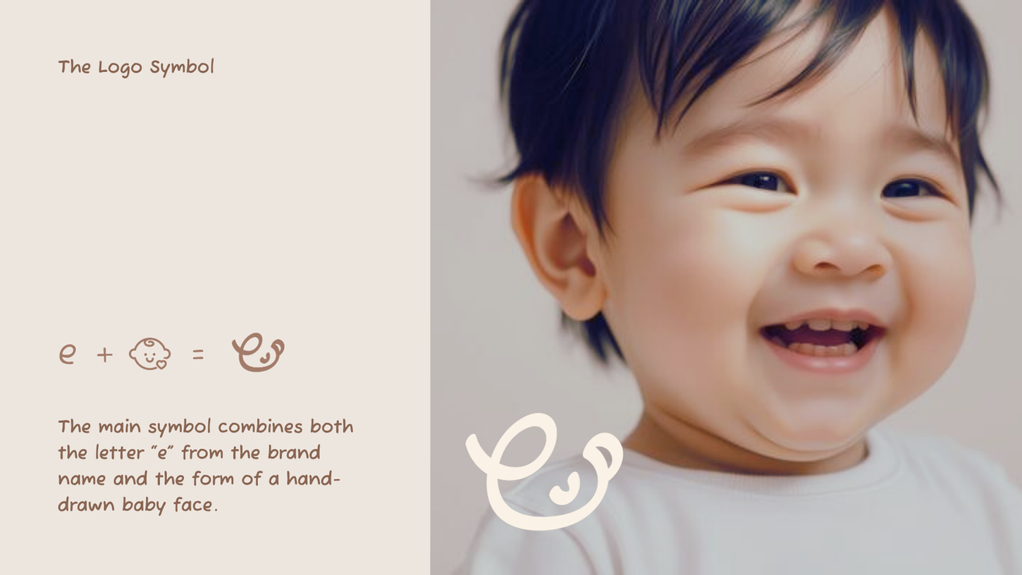
The logo features a rounded baby face with a small swirl of hair and a soft smile. At the same time, this shape cleverly forms the lowercase letter "e," tying back to the brand name. It’s both a character and a symbol: simple, meaningful, and expressive.
I chose a hand-drawn logotype to match the icon. The letterforms are slightly imperfect, with a soft and human quality that makes the brand feel approachable and real. The primary color palette is grounded in earth tones and soft neutrals, with pastel accents introduced through illustrated stickers and packaging elements.
What made this project special wasn’t the design itself, but the intention behind it. The slogan “Mua là nhớ, mặc vô là cười” (translated as “You’ll remember the buy, and smile with every wear”) became more than a phrase—it was a reflection of the emotional value the founder wanted every product to carry. This was a brand built for small joys and quiet care. And I designed it to feel exactly like that.

Project Type
Branding
Time
May-Jun 2023 (3 weeks)
Role
Brand Identity, Logo Design, Concept Development
Credit
Ms. Thao - Owner of Em Be Hon
Em Bé Hon is a branding project for a baby fashion and accessory startup founded by a mother - someone who deeply cherishes her connection with children and wanted to translate that love into a brand of her own. The business was built from personal care, crafted gifts, and quiet moments - not flashy marketing.
When she approached me, she didn’t ask for something trendy or loud. Instead, she shared a vision: a soft, minimal brand that would feel heartfelt, not commercial - something that would make both moms and babies smile. She wanted elegance, lightness, and warmth - a sense of emotional sincerity that’s often missing in overly colorful, overly animated kids’ branding.
This wasn’t just a baby brand. It was a gentle gesture from one mother to many others - and I wanted the identity to reflect that exact tone.


Project Summary
This project was a love letter to softness, sincerity, and emotional clarity. From the custom-drawn baby icon to the warm color palette and handwritten logo, every detail was crafted to feel caring, gentle, and quietly delightful.
Designing Em Bé Hon reminded me that branding doesn’t always have to be loud to be memorable. Sometimes, it’s the softest things that leave the strongest impression.
Thank you for scrolling to the end. If you have any questions or are interested in collaborating on a similar project, feel free to reach out at hello.quinnspire@gmail.com.


