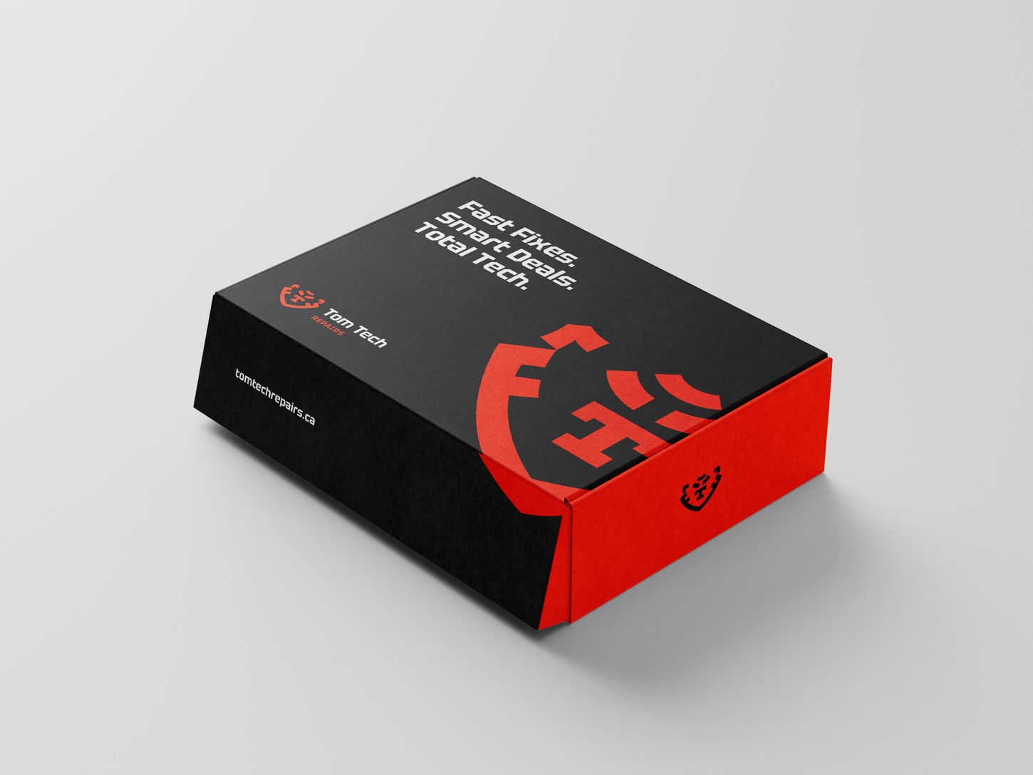
Tom Tech Repairs
Bold new identity for Kingston’s most trusted tech repair brand.
Creative Direction
Building the brand for Tom Tech Repairs wasn’t about chasing trends or design awards — it was about clarity, longevity, and building trust in the most grounded sense of the word.
Tommy, the founder, is a self-taught technician and someone I personally trust and admire. But like many business owners who’ve grown organically from skill and hustle, he had never thought much about branding before. That became my biggest challenge: to design an identity that was visually distinctive and creatively satisfying — but also immediately understandable and usable by someone who wasn’t from the world of design.
I approached this project with a clear rule: no overcomplication. Every idea had to earn its place by being both meaningful and practical. The logo needed to stand out in a crowded tech repair market, where most brands rely on generic icons like phones or tools — but it also had to be something Tommy could relate to and proudly show his customers.
That’s how the tiger came in — a personal symbol tied to Tommy’s nickname, turned into a bold emblem of strength, trust, and agility. The nose subtly forms the letter "T", adding just enough cleverness without becoming abstract. From signage to stickers to social media avatars, the logo was built to scale, flex, and work without needing constant explanation.
Designing for Tom Tech Repairs reminded me that good branding isn’t always about reinventing — sometimes, it’s about translating trust into design. And that means meeting the client where they are, then lifting them just enough to where they want to go.

Project Type
Branding
Time
Nov 2024 (2 weeks)
Role
Brand Identity, Logo Design, Concept Development
Credit
Elli Nguyen - Visualizer
Tom Tech Repairs is a trusted tech repair and service company based in Kingston, Canada. What began as a one-man venture has quickly grown into one of the city’s top-rated repair providers -offering mobile phone repairs, accessories, tech plans, and computer servicing.
Founded by Tommy, a self-taught technician with a passion for technology and community service, the brand has built a loyal customer base through transparency, quality, and word-of-mouth trust. With his ambitions growing beyond small-scale repairs, Tommy approached me to help redefine the brand for the next chapter - one that reflects professionalism, personality, and long-term growth.
My goal was to design an identity that could do more than sit on a storefront - a logo that could become a symbol of trust and tech confidence in the local market and beyond.


Project Summary
This project was personal — not just because Tommy is a friend, but because I got to design a brand that balances trust, ambition, and grit. It reminded me how much meaning a single logo can carry when it’s built from the values of the person behind it. I’m proud to have helped shape a visual identity that’s ready for growth but deeply rooted in local trust.
Thank you for scrolling to the end. If you have any questions or are interested in collaborating on a similar project, feel free to reach out at hello.quinnspire@gmail.com.


